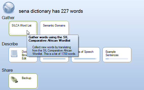
New Dashboard
It’s been a wild year for our team, and if all you do is follow this blog, you’d think we disappeared. Eric has moved to Microsoft (lucky them!), I’ve moved from Thailand to the USA and then Papua New Guinea, and two new guys have joined our team in Thailand. Amidst all that, I’ve fallen behind in blogging about our progress. In this post and others which should follow shortly, I’ll try to catch up.
Starting with version 0.4, we’ve changed the “dashboard” you see when WeSay opens up. With this change, we get more on the screen, lessening the need to scroll down. Also, the new design organizes tasks into groups so that users can have a sense of the workflow. Some of this will become more clear as we add tasks to the various sections.

You can see from this screenshot that we have some work to do on this still… the Word List task should display a “progress indicator” like we see in the second row. “Review” and “refine” are two more sections, which I hope to see populated in the future.