Andika and the visually impaired
SIL International’s Andika font was designed specifically with new readers in mind, but its features may help the visually impaired in similar ways.
The primary goal—to assist new readers
Andika is a font designed for teaching people around the world to read—adults as well as children. It is based on decades of legibility research, and, unlike other fonts used for literacy, includes the extended Latin alphabet support needed for many languages of Africa, Asia, and the Americas.
Too often literacy specialists working in languages across the globe have been required to use fonts that work against their goal of teaching people to read. Problems arise in two main areas. First, sans-serif letterforms—with no “little feet” on the letters—are often preferred by many for literacy work. However they can actually hinder new readers if their forms are too similar from letter to letter. This makes it difficult to distinguish between letters. Second, letters and diacritics (accents) necessary for writing many lesser-known languages are often not included in commercially available fonts.
A less-than-ideal solution is the use of multiple fonts to fill in the gaps. This is a tedious process which slows production and results in primers or other reading materials that are still potentially confusing because of the jumble of letter styles.
Andika provides a better solution that addresses both letter shapes and missing letters. Its design incorporates features known to aid letter recognition, thus avoiding the pitfalls of most sans-serif designs. And with over 3,700 glyphs included, nothing is lacking for writing the thousands of languages that use Latin script.
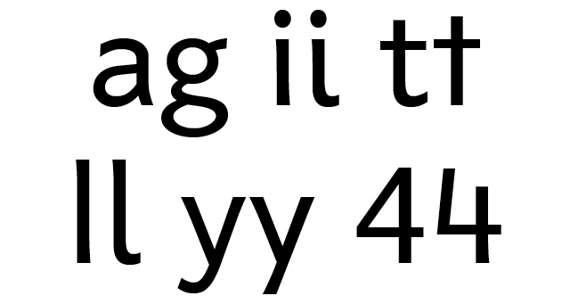
Visual features for high legibility
Andika has a wealth of features designed to maximize legibility and practicality. The letterforms are simple, almost monoline, and easy to copy with pencil or chalk.

Literacy specialists much prefer the simple (primary) shape of ‘a’ and ‘g’, as they look more like handwriting.
User-selectable alternates of many letters are included in order to accommodate different cultural or educational preferences.

Diacritics are strong and clear. High ascenders allow room for these accents. Multiple marks can be stacked yet not be misread as belonging to the line above.

Open counters (white spaces) make letters appear larger. They also aid letter distinction, especially for alphabets that include Latin letterforms such as ‘turned’ letters.

Letters that are commonly confused are designed to contrast with one another.

Ascenders and descenders have clear curves to aid in letter recognition.

Joins—where the straight stem attaches to other strokes—are low, as in handwriting. This is a known aid to legibility.

Letter shapes are clearly differentiated to reduce confusion. Similar bowls (enclosed rounded parts) are all slightly different.

Subtle emphasis is added to the beginning and end of some strokes, similar to handwritten forms. Note top left of h/n and bottom right of a/u. This gives clearer definition to the letters.

Some combinations of letters can be easily misread as a single letter. Andika carefully distinguishes these combinations.
How might this help those with impaired vision or dyslexia?
These features that optimize legibility for new readers may also be helpful for those whose vision is impaired or who have learning difficulties related to visual stress, such as dyslexia. Andika’s design team gathered feedback from many of SIL’s literacy specialists and also carefully reviewed findings from many years of legibility research, all of which fed directly into the font’s design. It shares the same features of other fonts that have been effective in improving reading for the impaired:
- Strong ascenders and descenders but with a large x-height
- Clearly differentiated forms of a, g, b, d, p, q
- Contrast between capitals, lowercase, and numerals (I l 1)
- Separation of letter combinations that are often misinterpreted (such as rn, lo)
- Avoidance of thin lines that can cause letters to break apart
- Generous spacing
Andika also provides these features in a style that is closer to traditional font styles, and using forms that are closer to normal handwritten ones. It demonstrates that it is possible to maximise letter recognition and legibility without resorting to distorted letterforms.
Feedback received about Andika highlights its success in producing highly readable and legible documents for a wide variety of environments:
- “Andika works very well with the app, as it’s nice and clear and spaced out enough to be easily read, even on a small phone screen.” (A literacy specialist in South Sudan using Reading App Builder to make their very first e-book, The Little Red Hen)
- “Andika helps me to print highly readable documents for my students suffering dyslexia.”
- “Andika is a free font, explicitly designed with the beginning reader in mind, and is therefore highly recommended.” (USAID report: Best practices for developing reading materials)
- “You’ve made a Year One teacher very happy!”
If you have found Andika to be helpful in cases of dyslexia or visual impairment, please write us and tell us your story.