Using Axis-Based Font Families
Improvements in font technology have made it possible and desirable to change how SIL font families that contain a range of font weights are organized. These changes may affect how font styles are chosen in the menus and dialog boxes of some applications. New axis-based font families open up exciting possibilities for greater typographic variety but can be confusing. This article hopes to reduce that confusion and help you understand how to work with these enhanced font families. This change to axis-based font families only affects projects that have multiple weights beyond common Regular, Italic, Bold, and Bold Italic styles.
‘RIBBI’ font families
SIL fonts have traditionally been organized into families of at most four fonts: Regular, Italic, Bold, and Bold Italic. These share a family name and work as expected with applications that have ‘B’ and ‘I’ buttons to switch between the styles. These are commonly referred to as ‘RIBBI’ families, even for two-member families with no italic styles.
If there were more styles or weights than fit into a single family, additional two- or four-member families were created with a different family name. Some examples:
- Gentium Plus (v6.200) had two families, with Book being slightly heavier:
- Gentium Plus (R, I, B, BI)
- Gentium Book Plus (R, I, B, BI)
- Dai Banna SIL (v3.000) had two families:
- Dai Banna SIL Light (R, I, B, BI)
- Dai Banna SIL Book (R, I, B, BI)
- Shimenkan has four families, each with two weights:
- Shimenkan Extra Light (R, B)
- Shimenkan Light (R, B)
- Shimenkan (R, B)
- Shimenkan Book (R, B)
If you were using Gentium Plus in Microsoft Word, but wanted bold text that was heavier than what the normal ‘B’ button provided, you would need to change the font to Gentium Book Plus, then hit the ‘B’ button.
‘Axis-based’ font families
It is now possible to group a wide range of font weights into a single font family. This has some advantages, particularly for web sites and web apps. We call these ‘axis-based’ families since the range of weights match up with the axis of weights that can be specified through the CSS font-weight property. An axis-based family with multiple weights could include all of these weights, but more commonly will include only some of them:
| Style/Weight name | Frequency | Corresponding CSS font-weight |
|---|---|---|
| Thin | rare | 100 |
| ExtraLight | rare | 200 |
| Light | common | 300 |
| Regular | required | 400 |
| Medium | common | 500 |
| SemiBold | common | 600 |
| Bold | common | 700 |
| ExtraBold | common | 800 |
| Black | rare | 900 |
Version 7 of Gentium is now axis-based, with five weights from Regular to ExtraBold. Gentium Book is a separate family with four axis-based weights from Regular to Bold. Their weights correspond in this way:
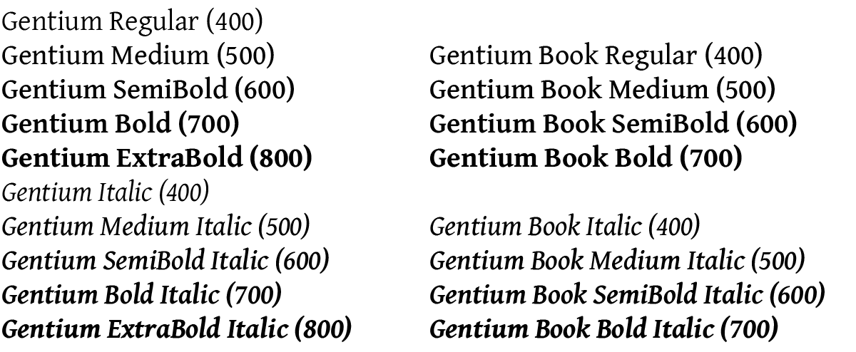
Italic styles are handled in a similar way, and continue to be linked to their non-italic counterparts.
Axis-based font families have many advantages:
- Weights can be more easily understood, avoiding confusing font names like Shimenkan Extra Light – Bold, which is currently ⅓ of the way between Shimenkan – Regular and Shimenkan Book – Regular.
- Applications that support axis-based families, like Adobe InDesign, present all of the weights together in menus and dialogs, making font choice and stylesheet definitions less complex.
- Web pages and applications can use the CSS font-weight property consistently. Currently ‘font-weight: 400’ produces inconsistent weights between RIBBI families.
- Users only have to install a single font family rather than multiple families that need explanation.
Application support
If you are using only the Regular and Bold (or Italic and Bold Italic) weights, axis-based fonts will work identically to RIBBI ones. There should be no change in how you choose those weights in applications. You will typically choose the font family to get Regular and then select Bold. If the app has ‘B’ and ‘I’ buttons (and corresponding keyboard shortcuts) they should work as expected.
Applications differ in how you choose the other weights (Light, ExtraBold). Although there is a wide variety in how that is done, even within a single app, there are are two main approaches:
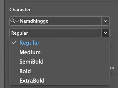
InDesign, Google Docs, and most macOS apps
These apps list the single family name and then offer the full range of weight options. This is considered to be the proper modern way for applications to present a family with multiple weights. It is used by Adobe InDesign, Google Docs, and most macOS apps. Examples:
In Adobe InDesign all weights, in weight order, are shown hierarchically under a single family name, or as separate options in a pop-up style menu.
Google Docs now supports many axis-based families and presents them as a single family. The ‘B’ button will always give you the standard Bold weight no matter what weight is currently applied to the text.
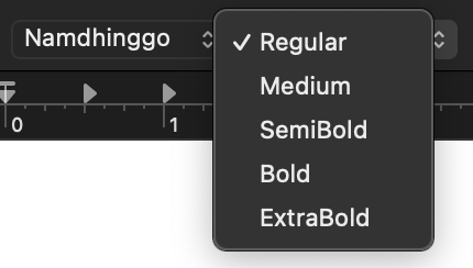
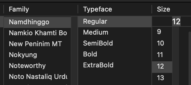
Many macOS apps present the family first, and offer the weight in a separate typeface style menu. The above example is from TextEdit.
Microsoft Word and some other Windows apps
These applications list weights (except Bold) as if they were separate families. This happens with Microsoft Word and some other applications on Windows. It can be confusing and cause problems.
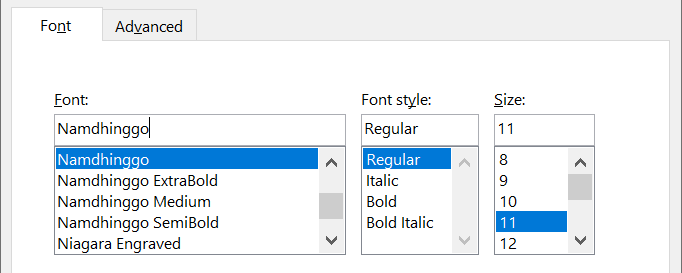
Microsoft Word (Windows) lists all the weights—except Bold—as if they were separate font families with the weight name added to the end of the family name. However there are some significant difficulties:
- The non-Bold weights are listed alphabetically rather than in weight order.
- The only way to select Bold in this dialog is to choose the plain font family name, then select Bold from the Font style menu.
- Warning: This dialog also offers styles that may not be available (such as Bold Italic). If they are chosen the system will create a fake version that may look terrible! If you choose ExtraBold in the Font list, then Bold in the Font style list you will get something heavier than ExtraBold but has been artificially created and will likely look bad. The same thing will happen if you use the “B” button or the Ctrl-B shortcut. Please complain to Microsoft if this odd behavior causes confusion.
SIL and axis-based font families
We are already producing and releasing axis-based families such as Namdhinggo and Gentium and more projects—both new and updated—will be axis-based in the future. Some common questions and answers:
Will all SIL fonts become axis-based? No, but most will. Existing SIL fonts that contain only Regular (or only Regular and Bold) may not change to be axis-based. However new fonts that have multiple weights will be axis-based.
When will projects switch to be axis-based? Since this is a major change we intend to only switch this when we are already planning a major version change (such as v6 to v7).
Will you be adding more weights (such as Light and Black) to existing families? In most cases, no. Becoming axis-based does not automatically produce additional weights, especially ones outside the range of existing weights (such as Light and Black). We may plan a switch to axis-based to coincide with adding new weights but the two do not need to happen at the same time.
What if I prefer to use RIBBI families for the additional weights? For projects that have had multiple RIBBI families but are now axis-based you can continue to use the older RIBBI versions—they will remain available. If there is a clear ongoing need for a separate RIBBI family, such as Gentium Book, we may continue to produce both a primary axis-based family and a separate alternate-weight family. However, that will not be our common practice.
Last updated: 2 June 2025