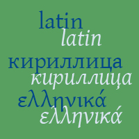
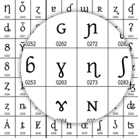
”Gentium” is a Latin word meaning belonging to the nations. The Gentium typeface family was created to enable the diverse ethnic groups—nations—around the world who use the Latin, Cyrillic, or Greek scripts to produce readable, high-quality publications. It supports almost the complete range of Unicode characters for these scripts, including a comprehensive range of diacritics and a large set of symbols useful for linguistics and literacy work.
Gentium’s design is intended to be highly readable, reasonably compact, and visually attractive. One design strategy for greater readability is to make slightly more generous counters, which are the spaces inside and around the strokes of the letters. For compactness, capital letters are modest in size and slightly compressed. For attractiveness, Gentium combines good design with careful letterspacing, plus a friendly, calligraphic character.
The Gentium family is a complete Greek font, supporting both monotonic and polytonic forms. While some Greek characters do closely resemble Latin ones, it is a separate design that embraces the robust, distinctive character of the Greek script, but does so within the design context of the whole typeface. As a result, the two scripts can be successfully mixed in a paragraph or page of text.


